Art of BI: Data Visualization Over the Years
Author: Bill Anderson | 7 min read | May 22, 2017
Data Visualization is the hottest job skill in the United States according to a new white paper published by Datavail. Most In-Demand Job in America? Data Visualization! explores the reasons data visualization skills are so valuable, so difficult, and so hard to find in university graduates. This white paper explores a number of solutions to the data visualization skills shortage. In this post, we will take a look at the origins of data visualization as a unique and well-paid career path.
Origins of Data Visualization
The visual representation of information dates back to the earliest maps, about 6,000 years BME. Representations of time began with the use of the sundial and eventually became codified in a calendar grid that is itself a “collapsed spiral” mapping the location of the sun. But data visualization is a little different than information visualization. Data visualization is the graphical representation of points in a data set.
“The earliest form of data visualization was in the form of a grid. A column of numbers made it easier to see events in sequence, while intersecting rows sorted the events into categories. The column number plus row number yielded a unique location in the grid. The tabulation of subtotals provided a breakdown of data sets and a quick look at results… The grid was the basis of double-entry bookkeeping, which allowed for the management of an enterprise of considerable size by providing an auditable trail of every transaction.” — Most In-Demand Job in America? Data Visualization!
The comparing of two variables in a grid led in the year 1350 to the first bar charts. The visual representation of data got a huge boost from the genius of Leonardo da Vinci, whose notebooks contained detailed drawings of data sets as a way to visually illustrate proportion and perspective and depth.

Image from Leonardo da Vinci notebook. Public Domain. Source: WikiMedia
Da Vinci’s techniques eventually led to the world’s first topographical map in 1782, representing altitude lines in a meaningful way, on a two-dimensional map. Adding a third variable to the grid intersection of latitude and longitude had long been the secret skill of the visual artist. In the 1800s, it shifted to the realm of the statistician.
Data visualization continued to expand in the early 1800s with the first circular “pie chart” by William Playfair, the Scottish economist. Near the end of the century, data visualization changed dramatically with the use of photography. Eadweard Muybridge’s still life images of people, objects, and animals in motion completely revolutionized theories about how forces like gravity work and how human muscle systems work. Muybridge’s sequential photos gave rise to the term “timeline.”
Data Visualization and the Computer
In the 1956, Bill Shockley at Bell Labs and his colleagues won the Nobel Prize in physics for the invention of the transistor and the information revolution took off with the invention of modern computers. In 1958, Hans Peter Luhn at IBM described the first “Business Intelligence System” as a computerized analysis of data presented in a user-friendly form. The 1960s saw the merger of data storage technology and data analysis into a new field.
“Data visualization begins to rise from dormancy around 1960. In the US, John W. Turkey recognizes the importance of the graphical analysis of data and develops new methods and innovations. In France, Jacques Bertin publishes his Semilogie Graphique, organizing vision and perception of graphical elements. Computers start to show their potential.” — Milestones in the History of Data Visualization
Data analysis morphs into data visualization over the 1970s and, at the end of the decade, out pops VisiCalc, the world’s first electronic spreadsheet bringing the grid to the PC. In 1983, Edward Tufts publishes a seminal work in business intelligence, The Visual Display of Quantitative Information. In 1983, the grid is connected to a database for the first time with the release of Lotus 1-2-3. Photoshop adds graphical imaging capabilities to computers in 1988. The decade ends with Howard Dresner at Gartner describing the first modern Business Intelligence System as a method of combining data storage and data analysis.
Seibel Analytics and the Rise of Data Visualization
In 2001, a new form of data analytics was born when the nQuire Server Suite 1.0 debuted as a search tool. In 2002, nQuire was aquired by Siebel Analytics, a name that became synonymous with data analytics and visualization. Siebel was purchased by Oracle in 2006 and rebranded as Oracle Business Intelligence Enterprise Edition in 2007. (A Potted History of OBIEE)
After Oracle bought Siebel Analytics, it seems like the big database firms piled into BI. SAP bought BusinessObjects in 2007. IBM bought Cognos in 2008. The merger of data storage with data analytics has turned the grid of old into animated, multimedia time-lapsed presentations built out of data sets that show how biological processes happen and how diseases spread.
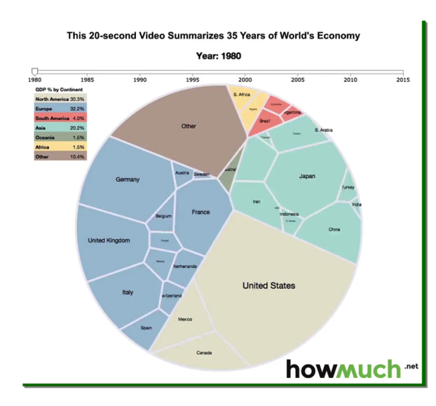
The above graphic is an example of a time-lapsed data visualization showing how national GDP changes over time by adjusting for both the size of the country and world percentage of total world GDP growth. The video can be viewed here.
The Future of Data Visualization
The future of data visualization is brighter than ever. As databases migrate to the cloud and enterprise software migrates to the cloud and data warehouses get better at storing a variety of data types and formats from formerly isolated areas of large enterprises, data visualization will be the key to making Big Data understandable, useful, secure, and reliable.
“Data visualization is behind breakthroughs in medical imagery, reductions in infant mortality, the fabulous returns of hedge funds, breakthroughs in genetic sequencing, and even the science of message targeting through social networks – it’s not going away any time soon.” — Most In-Demand Job in America? Data Visualization!
If you would like to take advantage of the benefits of business intelligence data visualization expertise, you don’t have to wait until you find a new hire. Datavail has experts who can set up and operate BI systems until the benefits of the system warrant an in-house position. Contact Datavail today for information about services in BI, analytics and data visualization.
Overview: 50 Years of Data Visualization
1970s
– The beginnings of computer-aided data visualization
– 1979 VisiCalc, the world’s fist electronic spreadsheet is introduced
1980s
– 1983 Edward Tuft publishes The Visual Display of Quantitative Information
– 1983 Lotus 1-2-3 released. Spreadsheet is connected to database for first time
– 1987 Microsoft Excel launched in conjunction with Windows operating system
– 1988 Photoshop graphics editing program released
– 1989 Howard Dresner at Gartner describes the first modern Business Intelligence system as a method of combining data storage and data analysis.
1990s
– 1994 William S. Cleveland publishes The Elements of Graphing Data
– 1994 Mozilla announces release of the first commercial “web browser,” a graphical user interface for navigating the Internet
– 1997 Edward Tuft publishes Visual Explanations: Images and Quantities, Evidence and Narrative
– 1997 Howard Wainer publishes Visual Revelations: Graphical Tales of Fate and Deception from Napolean Bonaparte to Ross Perot
– 1999 Information scientist Richard Saul Wurman gathers top data illustrators together in the book Understanding USA
– 1999 The beginning of animated online graphics
2000s
– 2002 Oracle introduces Oracle Outsourcing, the first “cloud” database service
– 2003 Tableau data visualization is formed by Stanford University alumni
– 2006 Oracle buys Siebel Analytics
– 2007 Oracle rebrands Siebel Analytics as Oracle Business Intelligence Enterprise Edition (OBIEE) and Oracle Business Intelligence Applications (OBIA)
– 2007 SAP buys BusinessObjects and rebrands it as BI software from SAP
– 2008 IBM buys Cognos and rebrands it as BI software from SAP
– 2010 The Wall Street Journal Guide to Information Graphics is published
– 2014 Library of Congress publishes “best practices for graphical displays”
Datavail is a specialized IT services company focused on Data Management with solutions in BI/DW, analytics, database administration, custom application development, and enterprise applications. We provide both professional and managed services delivered via our global delivery model, focused on Microsoft, Oracle and other leading technologies.